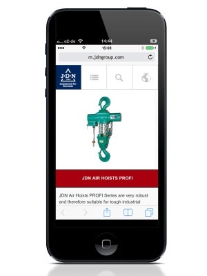
Materials handling and lifting equipment specialist JD Neuhaus has launched a mobile version of its website designed specifically for smartphones. With mobile phone users currently making up an estimated 15% of global internet traffic, it is becoming ever more important to have a website that looks good and functions correctly when viewed on a mobile device.
While visitors using desktop/laptop computers and iPad’s or tablets will continue to use the main company website at www.jdngroup.com, whenever a user visits the site whilst browsing via a mobile phone, the site will automatically detect and auto-redirect the user to the mobile version of the site at m.jdngroup.com. The mobile site has a simplified structure and has been adapted with responsive web design using HTML5 to offer easier navigation and fast load times, with each page having an optimised drop-down menu and search function. All icons and photos are provided in high resolution for sharp viewing on HD and retina displays.
The extensive J D Neuhaus product range of hoists and cranes can be viewed easily with all product categories directly reachable via the homepage. Technical data tables on the product pages are scrollable for ease of viewing and contact forms have been adapted for easy ‘fill-out’ when using the smaller screen of a mobile device.
Image: A typical screenshot from the new mobile version of the J D Neuhaus website. Photo: courtesy of JD Neuhaus.

